Are you feeling stuck in your checkout process? Or are you just looking for a little design inspiration as you plan how to take your ecommerce store's customer experience to the next level?
Either way, we have got you covered!
We have assembled nine unique and engaging checkout examples from some of the best ecommerce stores out there today.
Let's dive in and explore a range of effective tactics used by ecommerce stores!

The list of 9 ecommerce checkout page examples
Every successful ecommerce store follows a specific set of practices along with its brand style to provide customers with the best ecommerce checkout experience.
Based on this, we made a list of nine ecommerce checkout examples. Each example includes:
- A screenshot of the checkout page.
- A link to the website.
- A list of things that make the checkout page successful.
Let's get started with the checkout page examples!
1. Xero Shoes

You probably heard of minimalist shoes, or you may own a pair. We are talking about those shoes that give you the feel of being barefoot even though you are wearing them.
One seller of these Xero Shoes. Its checkout page is a great one, as it has some truly fantastic factors to look at.
Let's check those out.
What secrets make Xero Shoes' checkout page successful?
Clear message
At the top, Xero Shoes asks buyers to choose expedited shipping for an emergency.

The same goes for the pricing. At the bottom, it addressed the customers of countries other than the US of probable extra taxes/duties.
Such messages help the buyers prepare mentally so that anything sudden doesn't surprise them.
Trust badge
The blue logo '5,000 miles feels the world' is bound to catch attention. Who wouldn't be convinced by such a statement of that much-mile warranty?
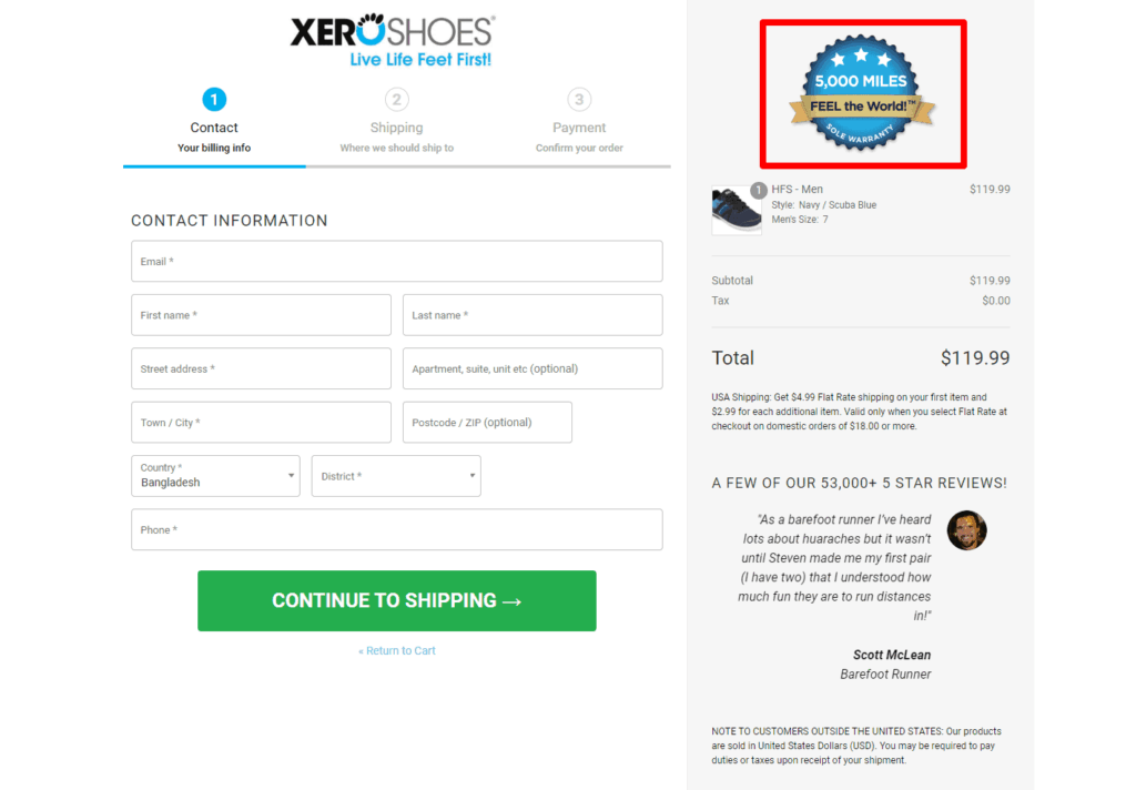
Also, at the bottom left side, a green tick mark with a written trusted site signals security and trust:

Progress bar indicator
The checkout page also has a progress bar indicator of three steps, making it easier for buyers to know which step they are in.
Social icons

Xero Shoes is strategically inviting customers to visit their social pages. At the left end, there are eight icons placed vertically. Buyers can choose to visit or connect with them.
Customer reviews
This is a persuasive approach for a checkout page. A positive review motivates the buyer to proceed further.
Client support
Xero Shoes has client support. Buyers can click on the blue 'Contact us' button, and a panel will open where they can send their queries.
2. Louis Vuitton

The next example is the fashion and luxury brand Louis Vuitton.
Its checkout page starts with a willingness to better assist the consumer, something every buyer looks forward to.
The brand is straightforward with its checkout page. They have provided almost every answer a buyer may have at this stage.
What secrets make Louis Vuitton's checkout page successful?
Segmentation

Have you noticed Louis Vuitton doesn't directly show a progress bar but indicates one? Buyers can find their way through the steps: first identification, second delivery options, and third payment.
Secure payment
Louis Vuitton's payment gateway options include PayPal, debit cards, credit cards (American Express, Visa card, Mastercard), etc. The website also has SSL encryption to safeguard customers' data.
SSL encryption is a highly effective technology that protects sensitive data between two systems. Such information assures buyers that their information will be handled with caution.
Shipping and delivery

Louis Vuitton allows convenient delivery options for its buyers. The shipping and delivery process is versatile, such as premium, overnight, green delivery (no impact on the environment), and in-store collection.
Exchange and returns
Many buyers worry about returns and exchanges from big brands. Louis Vuitton has addressed this concern on its checkout page.
A buyer can exchange and return their pristine condition product with the original package and documents within 30 days, except for personalized ones.
Environmentally-friendly packaging
That's something unique. Who mentions the environment on their checkout page?
Louis Vuitton does.
The company is steps ahead by mentioning environmental packaging, which is inspired by imperial saffron colors and made of thicker material.
Client facilities
Buyers can check the privacy policy, sign in for email, contact or make a call. Louis Vuitton footer has every option available.
3. Asos

Next on our list is Asos, a British ecommerce brand for fashion products.
This simple-looking checkout page doesn't include any images (apart from the product).
What's interesting about the Asos checkout page is that customers can also sign in with Google, Apple, and Facebook.
What secrets make Asos' checkout page successful?
Information security guarantee

Safety guarantees are significant elements that build customers' trust and confidence. At the top of Asos' checkout page, there is an icon of DigiCert, assuring the buyers that their submitted information will be kept private and secure.
Shipping country
Buyers don't have to worry if they will get Asos products delivered to their country. Asos has addressed this concern for them.
On the checkout page, there is a drop-down menu bar showing that the brand ships its products to over 50 countries. Once the buyer selects the country, the flag shows up automatically.

Promo code or voucher

Every website has promo codes or options like this available. And Asos showed this on the checkout page. If buyers hold a promo code, student code, or voucher, they can get the offer by placing it.
Asos has a referral offer option available.
Buyers who refer or get referred by friends both receive 20% off.
Wide ranges of payment gateway
Asos customers can make payments using their Visa, Visa Electron, Mastercard, PayPal, and American Express cards.
Simple checkout page
Asos' accordion-style checkout also includes terms and conditions, privacy, and return pages at the bottom. The ASOS Help option will lead buyers to the customer care page if they face any trouble.
4. Alphalete

Alphalete is another online store that sells custom-fitted clothing, footwear, and accessories for both men and women.
High-quality and comfortable products, excellent services, and fast delivery have made their customers stick with them.
It has an estimated revenue of $25-$50M in the last 12 months. That's huge, right?
Let's see its checkout page through which it makes this many sales!
What secrets make Alphalete's checkout page successful?
Progress bar indicator

Alphalete placed the progress bar at the top to make you notice it first.
We see the polite mention of the time required to fulfill an order so that the buyers remain patient with their ordering procedure.
Payment option

Alphalete allows three widely popular payment options - Shop Pay, PayPal, and Google Pay.
Alphalete has a newsletter sign-in option there. Putting the tick mark on the box right below the contact, buyers can allow receiving emails on any discount or special offers.
Gift card or discount/support code
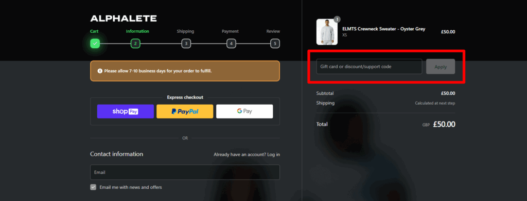
The page offers an option to submit any gift cards or discounts. If a buyer received a gift card or is eligible for a discount, they can activate it by entering the code.
Neat and clean design
The black-themed checkout page of Alphalete is quite pleasing to look at. The footer section has included the return policy, the privacy policy, and the terms of service.
5. Pandora

Pandora is renowned for making high-quality custom-designed ornaments at affordable prices.
With over 5,000 points of sale, Pandora is a global business.
The white color checkout page looks informative at first glance. Let's take a deeper look at it.
What secrets make Pandora's checkout page successful?
Progress bar indicator

On top of the checkout page, Pandora has a progress bar indicator making it easier for the buyers to find which stage they are in.
Secured payment gateways
It has a secured checkout option visible by the lock icon at the top.
Buyers can proceed with their payment through Pandora, Visa, Master Card, PayPal, American Express, Discover, Klarna, and Afterpay.
The payment doesn't have to be painful. Buyers can pay interest-free or pay less by using any suitable option. Here is what pandora says:

Free shipping on orders

Pandora directly shows their shipping timing on the checkout page, so buyers don't have to find out themselves.
The website is straightforward with the shipping payment. With a charge of over $75, Pandora home shipping takes up to four business days, and in-store pick-up takes two business days.
Easy return
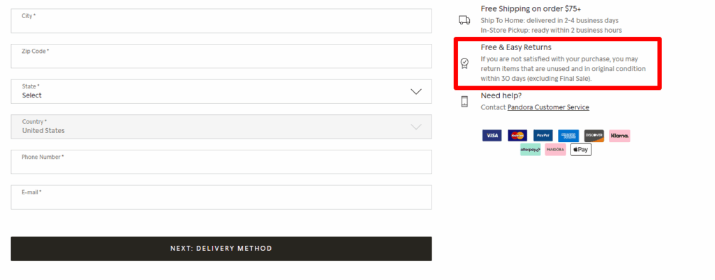
Many checkout pages have separate return policy pages in their footer section. But Pandora mentions allowing pristine condition product returns within 30 days with a simple message on the right side.
Client support
For any need, the buyers can reach them through the interlined customer service. That's a reassuring step for a checkout page.
6. Petco

Next on our list is Petco, a website in the pet niche.
The business is spread in over 1,500 locations across the US, Mexico, and Puerto Rico, from where millions of pet lovers are collecting their pet products quickly and conveniently.
Let's take a look at their checkout page.
What secrets make Petco's checkout page successful?
Guest checkout option

This is an excellent option for reducing cart abandonment. It saves time by leading the buyers directly to the checkout page. Customers can later create accounts at their suitable time.
Money saving

The first factor we saw was the word SAVE.
By using the Petco Pay credit card and getting approval, buyers can save a certain amount of money (it varies depending on the product).
Also, it has a daily free shipping option available for buyers who has a minimum online purchase of $35:

Client support
At the top section, Petco displayed their phone number so buyers can reach them for any issues they face and discuss them immediately.
Secured checkout
The website shows the security-ensuring lock icon beside the phone number to show that the transaction with Petco is safe.
Simple process
Petco made the checkout page look simple with just two simple processes. Those are the shipping and payment details.
7. Allbirds

We all are concerned about the environment. Some brands take extra advances towards that. Allbirds is one of them.
It is an American apparel and footwear company that sells sustainable and eco-friendly products from natural materials.
Its checkout page is a simple-looking one. Let's discuss what features it has on the checkout page that places it on our list.
What secrets make Allbirds' checkout page successful?
Different payment options

Allbirds payment gateways include ShopPay, Amazon Pay, and PayPal. To ensure a smooth ecommerce checkout flow, buyers can also use a credit card.
Newsletter sign in
Allbirds also allows sending offers and news through email. If buyers want to receive those, they can put a tick on the box.
Summary details
On the right side, buyers can see the total cost of the desired product.
Allbirds clarifies to the buyer that it does not process expedited orders on holidays. This makes a buyer feel honest about the brand.
Gift card
Allbirds' checkout page also shows that buyers can use their gift card for the checkout process to complete.
Direct assistant through chat

There is a refund policy, privacy policy, and terms of service included at the bottom.
Even so, if buyers need to communicate, there's a chat button available. That's a great idea indeed!
8. Brooklinen
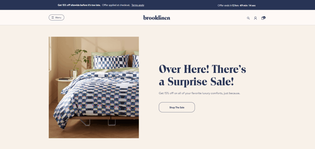
The following ecommerce checkout page example in our list is from Brooklinen, a brand of high-quality, cozy products for the bed, bath, and loungewear.
Looking at its checkout page, we find similarities to Allbirds.
The off-white color page is divided into two parts, the left side is filled with the required information, and the right side is about the product summary.
What secrets make Brooklinen's checkout page successful?
Promotional offer
At the very top, Brooklinen shows the offer with a countdown. This one fact encourages the buyer and creates a sense of urgency:

Progress indicator
Brooklinen has a progress bar. It is slightly different from the ones we have seen on other websites on our list.
Popular payment methods
It supports three popular payment options - ShopPay, Amazon Pay, and Paypal.
Newsletter through text
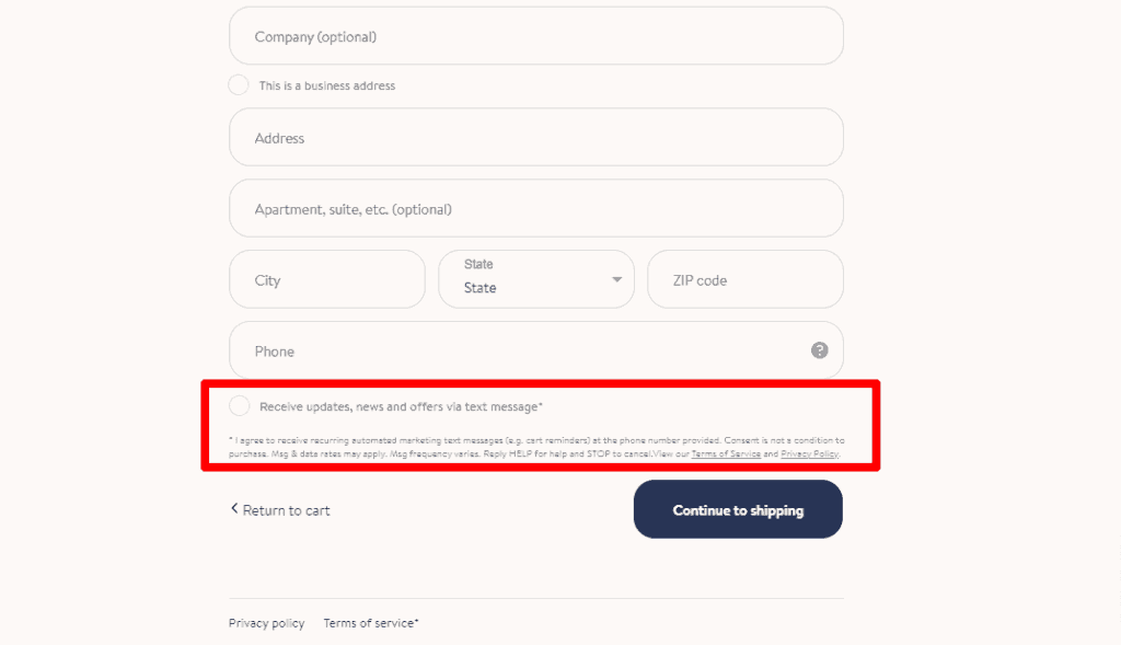
Buyers can choose to get updates, news, or other offers from them. It allows the text message option as well.
Gift card and promo code
Brooklinen also has included gift card and promo code options on the checkout page. Buyers can make purchases with those who have gift cards or discount codes.
9. Fabletics

We have reached our last example checkout, and that is Fabletics. This, too, is an apparel brand but mainly designed for activewear.
Buyers can purchase products as a non-member (as a guest) or by signing in. Later they can become a VIP member to get products at the best prices.
What secrets make Fabletics' checkout page successful?
One-page checkout
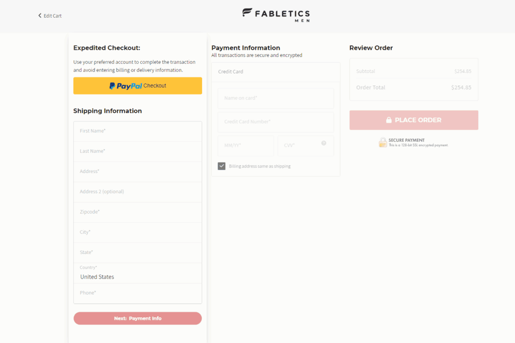
Fabletics has a one-page checkout. Buyers can see every step included there. After completing one section, they can access the next section.
Multiple payment options

Fabletics allows payment with giant payment platforms, including PayPal, Afterpay, debit/credit cards, Visa, MasterCard, and American Express.
Secure transaction
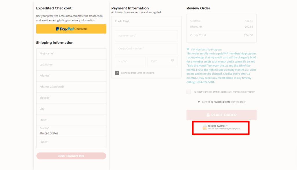
Fabletics ensure a secure payment option. It has a 128-bit SSL encrypted payment to ensure safe transactions. This strong SSL security protects transferred data between the buyer and the website.
Mobile version available
Buyers can continue and complete their payments through widely popular mobile platforms.
8 Tips for building a highly-converting ecommerce checkout page
We are close to the conclusion.
On that note, here are some quick tips to help you build a seamless and client-friendly ecommerce checkout flow.
1. Enable guest checkout in your ecommerce store

Guest checkout allows buyers to purchase products without creating an account. For buyers, purchasing something online is a time-saving and fast method.
Enabling guest checkout doesn't store buyers' information, as they don't have to sign in. It's especially convenient for one-time buyers and results in a lower cart abandonment rate.
Websites like 'Petco' and 'Fabletics' are examples that have allowed guest checkout options.
2. Use trust signals and badges to build customer confidence
A brand badge indicates authenticity, a fair deal, and secure service.
Placing a badge right on a checkout page works as a guarantee that customers can trust you.
Just like 'Xero Shoes' shows a badge on its checkout page with a promise.
Also, websites like Fabletics and Louis Vuitton show secure payment guarantees:

These are trust signals that help drive insecure feelings away among buyers.
So, our recommendation is:
- Use a badge complying with your product.
- Have a believable and bold statement.
- Show the security protection on the checkout page.
3. Add customer reviews on the checkout page
92% of consumers trust word of mouth. And which other option can be as massive as customer reviews?
Customer reviews tell about a buyer's experience with that particular brand. Such reviews are the most persuasive proof that engages buyers and builds credibility among them.
We want to point out that 'Xero Shoes' from our list has added a customer review on their checkout page:

So, our recommendations:
- Ask real customers to write a review for you.
- Make the review scannable.
- Use an easily readable font.
4. Offer multiple payment options
A single payment option limits a customer's shopping experience, whereas multiple payment options attract customers of diverse ranges.
Thus, this option will help you to increase conversion and decrease cart abandonment.
From our list, we can mention 'Alphalete,' 'Louis Vuitton,' 'Fabletics,' and 'Pandora' as ecommerce checkout page examples that have multiple payment options.
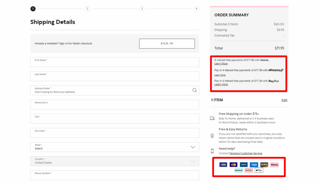
So, our recommendations are:
- Have various popular payment gateways.
- Allow gift cards, coupons, and discounts for paying.
- Some payment options allow special offers; mention that as well.
5. Build a progress bar indicator
Progress indicator works as a guideline for customers that help clear the confusion about the checkout process.
It shows which stage they are in now, what to step next, and how close they are to their desired product.
From our list, 'Xero Shoes,' 'Alphalete,' 'Pandora,' and 'Brooklinen' are some great examples of showing progress bar indicators:
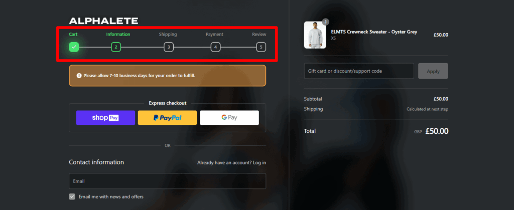
So, we recommend:
- Placing it at a spot where it is visible (i.e., header section).
- Don't make the steps too long.
6. Focus on mobile responsive UX design
79% of users buy products online through their mobile phones. So, a mobile-friendly checkout page is essential. Generally, most ecommerce platforms are optimized for mobile.
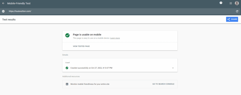
Target mobile responsive UX design apart from the desktop version and make sure it supports different platforms.
All of our listed checkout pages are mobile responsive.
So, we recommend:
- Keep the design simple.
- Use a responsive theme.
- Check the page's mobile version firsthand.
7. Offer customer support
Having customer support placed on the checkout page gives the customer a sense of reliability.
Many websites placed customer support options, such as contact us, chat option, or phone numbers, for times when customers face issues.
Examples of ecommerce websites with customer support centers are 'Louis Vuitton,' 'Petco,' 'Allbirds,' and 'Brooklinen.'

Thus, our recommendations are:
- Be transparent and actionable.
- If you can't be available, inform that as well. This message shows the brand's professionalism and responsibility for its awaited customers.

8. Do a test order
After optimizing every best practice you want for your checkout page, it's time to take it to the test.
You can go for split testing (known as A/B testing to finalize the best product version) among your teammates or within your company.
By experimenting firsthand, you will understand if the page is easily functional enough or if you need further adjustment.
If everything is okay, you can launch it to the public.
Turn this guide into an AI checklist
Click your favorite AI tool below to get a short summary and step-by-step checklist based on this article.Prefer ChatGPT? Open this guide in ChatGPT with a pre-filled prompt (most readers start here).
Review Your Store Before You Scale
Getting traffic but not enough sales? Use this store review checklist to spot trust issues, weak product pages, and conversion blockers.
Taking action
Reading and absorbing information and knowledge is excellent (definitely if it's free!), but do you know what's even better?
Taking action!
So, to help you with taking action with what you have learned in this article, take a look at the bullet points:
- If you are new to creating your new online store, here's a guideline for you.
- Check this article to get inspired by some product ideas.
- While working on the checkout page, don't make it cluttered with too much information. Keep it neat and clean. Only include information that is relevant to the payment option.
- Some product pages show product details along with the summary. This stops buyers from going back and forth to check the product on that page.
- Checkout pages have variations. It can be one page or multi pages. A multi-page checkout page takes time, and many buyers may not choose to stay that long. So, by bringing all those in short to one page, you can cut the time.
- Check this article to find out which payment gateway you can integrate with your store.
Conclusion
There you have it; a list of some best ecommerce checkout page examples. Checkout pages have variations. But those that give a sense of security, comfort, and an easy shopping experience are the best.
There is no limit to upgrading an ecommerce page. Also, finding the best design for a checkout page is not a matter of the first attempt in most cases.
So, always check and apply a different design or best practice to find which works best for you and ensure a smooth payment and purchasing experience for your customers.
Good luck with designing your checkout page!
Want to learn more about ecommerce?
Ready to move your online store to the next level? Check out the articles below:
- 9 Ecommerce Landing Page Examples in 2026 (+ 9 Tips)
- The 5 Best Ecommerce Platforms for Dropshipping in 2026
- 10 Product Page Examples From Ecommerce Stores | Inspiration
Plus, don't forget to check out our in-depth how to start an online store guide here.


2 Comments
Some great examples here. I always advocate for guest checkouts, and I think the progress bar indicator can be a nice touch too. It’s definitely important to have multiple payment gateways. If customers have a preferred way of paying online they might be hesitant to shop at a site that doesn’t offer that method.
Hi Joe,
Thank you for your great comment! I’m sure it will help someone reading this article 😊
Good luck with everything!
– Richard