Looking for ecommerce product page examples?
I bet you are struggling to find some good ones.
Well-decorated ecommerce product pages are hard to find, and those continue to convince viewers as well as competitors.
Every product page has various uniquenesses that make it different from others. So, if you are looking to accumulate some awesome ideas for your ecommerce product page, you are at the right place.
In this article, we will look at competitive ecommerce product pages that you can learn a thing or two from, which you can then apply to your own website!

What is an ecommerce product page?
An ecommerce product page is a type of web page you create to sell items online. You can use an ecommerce product page for a one-off sale, an ongoing subscription service, or an entire online store where customers can buy everything they need.
Ecommerce product pages must be more than images and carefully chosen captions. They need to serve multiple purposes and fulfill many different needs, so the best way to evaluate their quality is to identify who will be looking at them.
By keeping your main goals on clarity, trust, and ease of use, you can design an excellent product page layout.
Building your ecommerce store? Start simple
Free 3-day trial + $1/month for 3 months
- Set up products, checkout, payments, and apps in one dashboard
- Test your store setup before adding too many tools or pages
- Start lean, then improve the store once you see what works
No credit card required.
Top 10 examples of effective ecommerce product pages
Are you ready for this?
We have studied the best practices for ecommerce product descriptions and product pages that will make your competitors jealous.
Picking up just one or two of these strategies should go a long way towards improving your visitor's experience on your product page!
You can improve on what you've got or build a product page from scratch.
Whatever route you take, we hope you find these best practices helpful on the way to creating the best online shopping experience possible.
So, without further ado, let's check out the ecommerce product page examples!
1. BlendJet

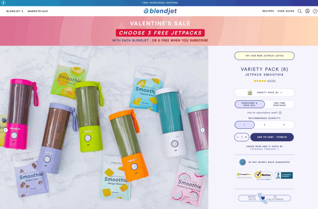
The first example starts with a single product page, a blender.
However, it's not just your average blender because it's portable and designed by Blendjet!
The page is interesting. Instead of showing 2D images, there are a couple of videos of how to use the product, what it does, and the variations.
I mean, don't you think the page is very pleasing to look at?
What makes Blendjet an unbeatable product page?
- High resolution GIFs/Videos. It directly shows you how the product works with videos. And the secret to that is - these videos are GIFs!
The GIFs they used are crisp, high quality, and explain everything in a flash without the need of reading text. This is a better alternative to having videos that require a click to start playing. - Consistent color scheme paired with great copy. Not only do the text and images follow a consistent color scheme, but also the videos (GIFs).
All the elements are well placed and the color combination is eye pleasing. Combined with the informative marketing copies, this page has done an applauding job. - Pictorial reviews. All of the reviews on the product page are pictorial, which is essential for new buyers to understand what the product looks like in real life.
On the note of consistency, the review pictures are cropped in a consistent fashion as well. Extra efforts like these go a long way in keeping the product page in tip top shape.
2. Wayfair

Wayfair Inc. is an ecommerce website for furniture and home goods based in the US. It started business in 2002. (And yes, they use dropshipping as part of their fulfillment process)
Now, their digital marketplace offers 14 million goods sold by more than 11,000 different vendors globally.
It's not just a place; it's a platform for a wide range of home decor products, which are well organized and categorized.
What makes Wayfair an unbeatable product page?
- Simplicity without sacrificing information. A pure black and white (alongside the purple brand color) color scheme leaves a lot of space for the content to receive attention. This is a bold choice because such a simple color palette is not favored by modern website designers.
But if you can leverage the full potential of simplicity, colorfulness almost doesn't stand a chance! All of the text is neatly organized and expertly formatted with ample information. Because of that, it doesn't feel hard to read either. - Comprehensive product pictures. Every product gets high quality pictures from every angle and, most importantly, in many contexts. It shows pictures of products placed in a room specifically designed to suit them, which makes the product seem more valuable.
Additionally, Wayfair provides individual pictures of the product's dimensions, sizes, and special features. - Suggested items. Wayfair allows users to compare their products with similar ones. It does the work by providing similar items to compare to and frequently bought together compatible products.
This saves a lot of time on the consumer's end, especially if the suggested items are actually interesting!
3. Inspire Uplift

Inspire Uplift was started as a social media-focused ecommerce store for products in a variety of niches. It has since turned into a global business platform.
Therefore, Inspire Uplift has been in the business for a long time and sells all kinds of products ranging from home, garden, kitchen, beauty, fashion, electronics, and more.
What makes Inspire Uplift an unbeatable product page?
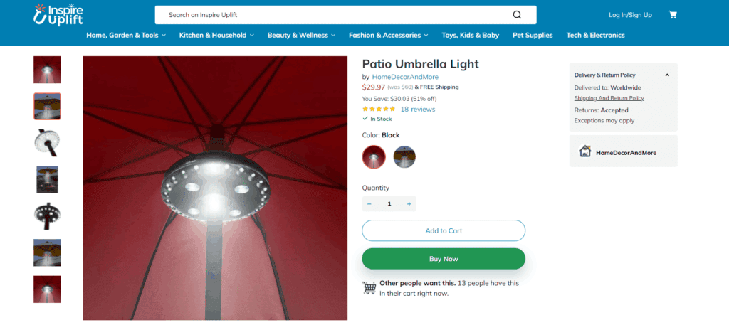
- Sense of urgency. Knowing the number of people who have the product in the cart psychologically impacts a product page. It's like buyers bring buyers.
When a consumer spends ample time thinking about buying something, subtle information like numbers rewinds in their mind 'hurry up before the stock runs out' or 'if this product has such a high demand, it must be good!' - Discounts on top of discounts. Not only do they provide free shipping for most products, but they also offer over 50% in terms of discounts.
Displaying the percentage and money saved on such juicy discounts helps the consumer want to act on it fast. - Lots of space for reviews. As with all great product pages, Wayfair provides plenty of space to showcase all kinds of reviews.
You need potential consumers to know more about your product without having to research it elsewhere. And when they learn it through reviews, it keeps them on your page!
4. Magic Mind

Product pages that focus on only one item as a whole need to capture the essence of the product entirely. Magic Mind is like that, a page about an energy drink.
For those looking to cut their caffeine and want to follow a balanced eating habit backed by a healthy drink, this is a really effective place for them to land.
The page has well-written and well-placed information that won't feel verbose.
Tip: Ready to build a landing page for your ecommerce store but not sure what tool to use? Check out the 11 best ClickFunnels alternatives here!
What makes Magic Mind an unbeatable product page?
- Minimalistic design blended with gentle colors. Considering this is a herbal energy drink aimed to imitate the effect of coffee, the product page layout suits the design perfectly.
The colors are placed strategically and elegantly, as are the product and text backgrounds. A simple black and white combination aims to reflect the purity of the drink. The gentle splashes of peach, purple, orange, sea blue, and pink provide some life to the minimalist layout. - Multiple purchase options. Besides the common one time purchase option, Magic Mind gives a subscription option.
The subscription package helps the consumer save a lot in the long run. The product page also features a beautiful bulleted list of what the customer gets with each purchase option, creating an easier decision process. - Elaborative & creative content. This product page has got all the content bases covered in an attractive font and format. Examples include parts like comparisons of coffee and other energy drinks, ingredients, how to get the most out of it, FAQs, Reviews, Shipping details for various regions.
Creativity can be found in the CTA too; instead of simply saying 'Buy Now', they used 'Enter Flow State'.
5. Drop Bottle

Drop Bottle, though it looks like an everyday bottle, it's much more than that.
It's an eco-friendly bottle that can be used for drinking various drinks like detox water, juice, and tea.
The product page is plain and simple with clear intentions of convincing us to use natural material products and keep our bodies hydrated.
What makes Drop Bottle an unbeatable product page?
- Color combinations based on the product. The product page is eloquently designed to complement the rose gold gap of the bottle. The background, CTA button, and other page colors are designed with the product in mind. This shows a high level of attention to detail, which may increase your customer's trust!
- Professional affiliations. The product page shows affiliation with popular companies like L'Oréal Paris, Kiehl's, and more. This enhances credibility with the product and lets the buyer know that they can trust it, even without reading reviews.
- Picture perfect reviews. Most of the reviews are given by consumers who beautifully captured the product. It's almost as if the consumers are photographers themselves! Not all consumers will give picture perfect reviews, but actively filtering the ones who do and letting those show first on the product page is ideal.
Tip: Did you know that you can speed up your product page creation process by using a tool like PagePilot? It can generate entire product pages for you in just a few clicks!
6. Allbirds

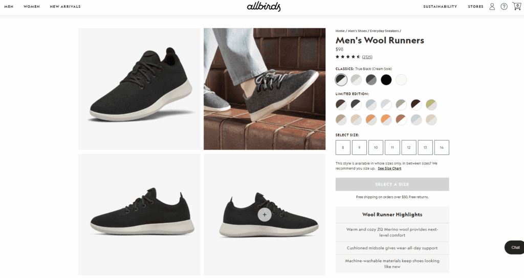
Allbirds is an ecommerce store dedicated primarily to selling footwear and other relevant products.
Its products are made from natural materials, have a flashy logo design, and are comfortable to wear for any person.
The website differentiates itself with simplicity, like its products. Within a couple of minutes, you simply understand how they make you feel and why they are unique.
What makes Allbirds an unbeatable product page?
- Great product design. Before making a great product page, you must ensure that the product is great to begin with. It might as well be a shoe, but that's where ingenuity lies, to create something great out of something simple. Allbirds' shoes are well designed with equally great supplementary product photos.
- GIFs in use. Allbirds product has GIFs showing the item in action. Consumers love imagining how it would look on their feet by seeing how it looks on others' feet.
- Care guide. As with all product pages, content is crucial. Along with covering all the content categories, this product page has an additional category called 'Care Guide'. What this does is inform the consumer on how to care for the product without having to read about it elsewhere.
- Transparent in action. Telling your consumers that your product isn't indestructible but needs care. Letting this be known on the product page immediately rather than having them figure it out after purchase is better.
7. Four Sigmatic

Starting its journey in Finland, Four Sigmatic is geared towards warm and healthy beverages like coffee, cacao mix, smoothies, and more.
There's some idea that needs to be cleared out, and the product page has very convincingly made its every point clear.
Hovering over the whole page will make viewers feel like it's a tour. Sounds interesting, isn't it?
What makes Four Sigmatic an unbeatable product page?
- Out of package pictures. It's a brave step to show bare coffee grounds without packaging and any other background decor, which they have done. Once again, this establishes a sense of transparency and authenticity in the product. Highlighting such pictures in the product pages needs to be done if you're following this route.
- Reviews from popular figures. Alongside reviews from their buyers, they have highlighted reviews from several celebrities on the product page. The reviews may be sponsored, and the celebrities aren't all A listers, but that doesn't matter.
Even if consumers have a sense you sponsored them, the fact that you invested in sponsoring them shows that you believe in your product, which makes the consumer believe in it too. - Multiple purchase options. This is indeed a great avenue for products that get depleted, typically food products. Having them subscribe to your product and get deals on their subscription makes for a good product page feature.
8. Lush USA

Lush started its journey in the cosmetics industry in 1995.
It has been selling a wide range of cosmetic (beauty and bath) products to give users a feeling of refreshment and relaxation.
Going through the webpage feels like it serves value. It doesn't feel like it is selling a product like a banal ecommerce page, rather it is offering an important product.
The product page is prepared to keep nature in mind so that people can have that feeling, and it deserves appreciation for that.
What makes Lush USA an unbeatable product Page?
- Content supplementing the product. The content is wrapped delicately around what consumers need to know about the product without it being too direct. The content highlights what the product smells like and feels like.
Instead of telling, it shows it is one of the best by 'this is how our product is' route, which works great. - Consistent display. The product page contains a list of other best selling soaps in a consistent fashion. All the main product images are captured at the same exact angle with the same background. This makes the list look much cleaner and more consistent.
- Ingredient specified. Lush takes pride in their product being organic. As a proof, every product has a distinctive section to exhibit the elements, which is indeed a unique approach. So, product finders can check this out and pick the one exactly they need.
9. Magna Tiles

Magna-Tiles' website has a playful and inviting design that appeals to both parents and children. This educational toy brand specializes in magnetic building tiles that inspire creativity and learning through play.
Their product pages stand out for their engaging design that perfectly captures the brand's focus on creativity and learning.
If you are looking for a store that has a unique charm, take a look here, and it won't go to waste!
What makes Magna Tiles an unbeatable product page?
- Well shot product images. Magna Tiles' product pages have well-shot images that showcase the products from different angles. The vibrant, detailed photos help customers visualize what they're buying, adding a layer of excitement and confidence to their purchase.
- Elaborative description. The product description has a reader friendly theme. They also feature a video that shows how to use or assemble the products.

- User-friendly design. The layout is clean and easy to navigate, with well-organized sections that provide a seamless browsing experience. Key details like pricing, shipping information, and customer reviews are easy to find.
Note: Want to know how to make your product pages even better? Check out ConvertMate 一 a Shopify app that uses AI to optimize product pages, improve SEO, and track customer behavior.
10. Until Gone

Until Gone is a website with a wide range of products, it is determined to provide buyers with effective and helpful user experiences.
Landing on the website, the first impression the viewers are likely to have is that the owner of this page believes in simplicity.
It is a blend of creativity and simplicity. They used what works well in product page design and built their own pillars.
What makes Until Gone an unbeatable product page?
- Easy navigation. The information it provides is accessible and the page is easy to navigate. The page has made its content, target, and intention clear so that audiences don't lose themselves. It even guarantees to provide secure shopping.
- Enforces trust through guarantees. Until Gone's products are relatively low priced. The store uses utilizes guarantees to entice potential customers. As such, they offer a 'stress free guarantee' and free shipping, but only on orders that are over $25.
- Possible variations. Until Gone does not only upload high-quality pictures of their products, but they upload the product in other available colors. So, if a product's color doesn't fit your taste, you can buy it in another color. You can also pay for any product of your choice in installments.
Turn this guide into an AI checklist
Click your favorite AI tool below to get a short summary and step-by-step checklist based on this article.Prefer ChatGPT? Open this guide in ChatGPT with a pre-filled prompt (most readers start here).
Conclusion
We hope you are satisfied with today's best product page examples and can use them for inspiration in your own ecommerce ventures!
Take your time to understand this part so that once you kickstart, nothing comes in the way.
Do research ask around people around you who already have the work started. You will find the right way.
And don't forget, if you have any questions left, just tell us in the comments below!
Good luck with everything!
Want to learn more about ecommerce?
Ready to move your online store to the next level? Check out the articles below:
- 14 Great Facebook Ad Examples for Ecommerce
- 11 Great White Label Product Examples to Sell Online
- 9 Ecommerce Landing Page Examples in 2026 (+ 9 Tips)
Plus, don't forget to check out our in-depth how to start an online store guide here.


