If your dropshipping store is getting traffic but not enough orders, it's tempting to install another app or start changing random parts of the page.
But that's usually the wrong place to start.
Start with the basics: can people understand what you sell and trust the store?
Can they find the information they need and complete an order without friction?
This checklist gives you 50 practical checks across that customer journey.
The good news? You probably won't need all 50.
Some are essentials. Others only make sense once your store has enough traffic or repeat customers to justify them.
Key takeaways
- Fix first: anything that stops someone from understanding your offer or completing an order.
- Check next: product information and shipping expectations. Then review returns, trust signals, and customer support.
- Use your data: look for where shoppers drop out before copying another store's conversion tactics.
- Treat as experiments: popups and bundles plus upsells and free-shipping thresholds. Don't treat conversion tactics as requirements.
- Avoid: fake scarcity and invented reviews. Drop unsupported claims or anything that makes the store look less trustworthy.
How to use this store review
Here's the easiest way to use it.
Do one full pass before changing anything.
Open your store on a phone and a desktop. Then go through the checklist as if you were a new customer who knows nothing about the brand.
- Fix now: broken checkout steps and unclear offers. Also fix missing shipping information, security problems, or anything that stops a purchase.
- Improve next: weak product pages and poor mobile UX. Then fix missing trust information or confusing policies.
- Test later: bundles and upsells plus popups and subscriptions. These tactics need enough traffic to judge properly.
Why this order?
Because there isn't much value in testing a cart upsell if customers can't tell when the original product will arrive.
1. First impression and trust
Let's start with the part every new visitor sees first.
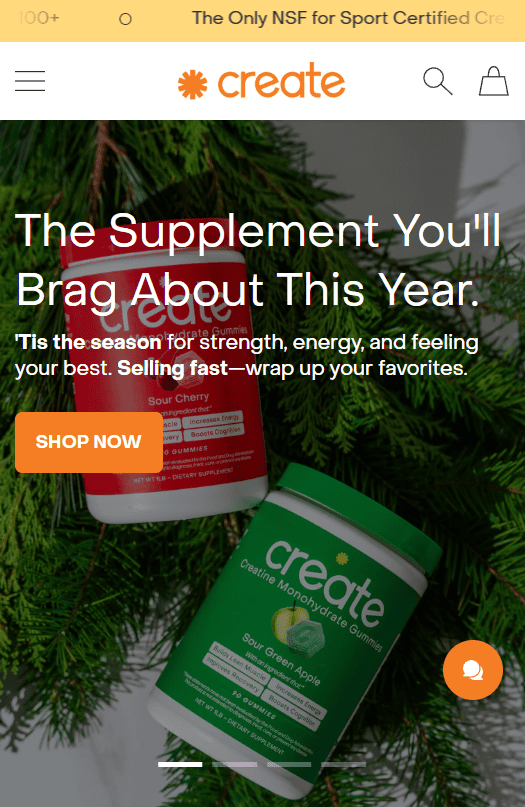
1. Five-second clarity: Can someone tell what you sell almost immediately?
Your homepage should make the store's purpose obvious without making visitors decode a vague slogan.
Show the product or category clearly. Pair it with a short headline that explains the main value and an obvious next action.
A simple test works well here: show the homepage to someone who has never seen it before. Give them a few seconds and ask what the store sells.
2. Clear first screen: Is the main offer easy to understand before someone starts scrolling?
The first screen doesn't need to explain everything.
It should make three things clear: what you sell, why someone should care, and what they can do next.
3. Consistent branding: Do your logo and colors match your favicon and store name?
You don't need an expensive brand identity to look credible.
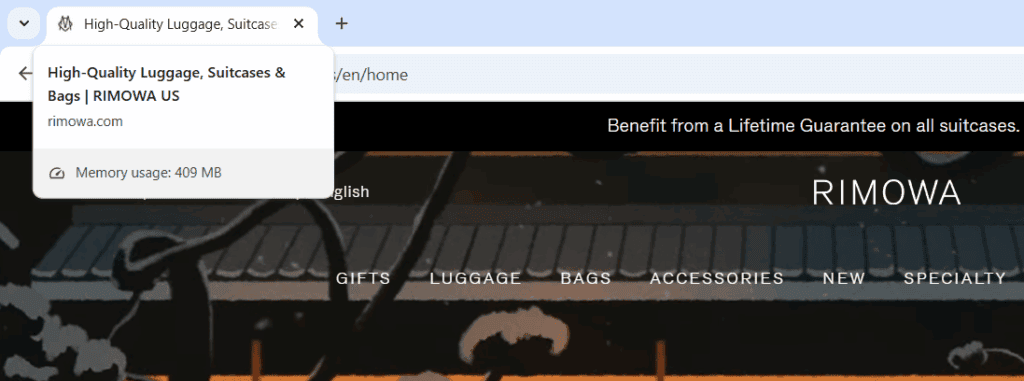
But you do need consistency. Use a readable logo and a real favicon. Matching colors and the correct store name matter more than a flashy design that changes from page to page.
If your browser tab still says something generic like "My Shopify Store," finish that setup before spending time on decorative details.
Learn more: How to Get a Logo for Your Dropshipping Store? (5 Options)
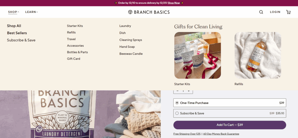
4. Simple navigation: Can visitors reach your main products and cart without hunting? Can they also find contact details and policies?
Your menu should help people move through the store. It shouldn't become a list of every page you have.
Keep the main choices obvious. If you have a larger catalog, make search and collection filters easy to find.
A sticky header can be useful on long pages, but it isn't mandatory. Test whether it improves navigation without taking up too much mobile screen space.
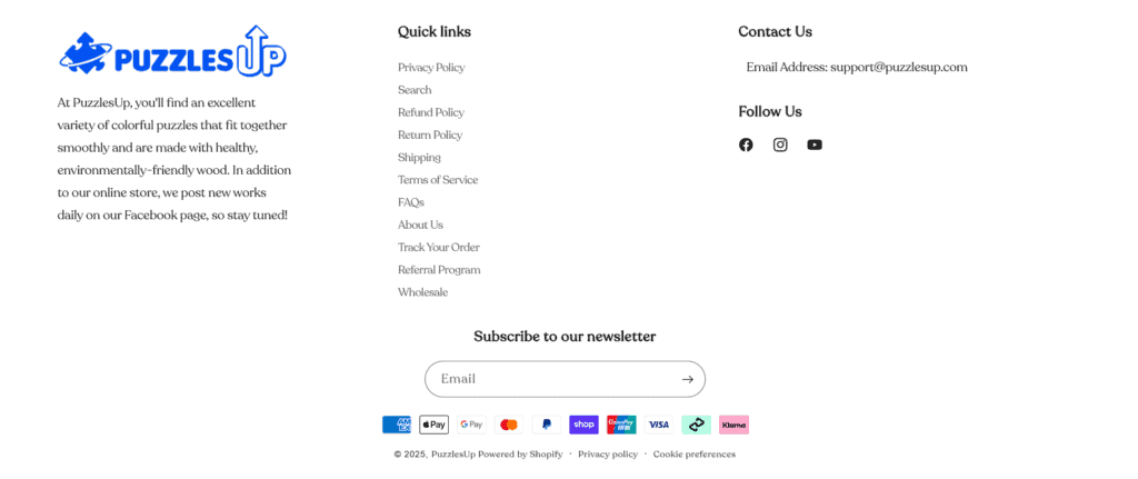
5. Useful footer: Can shoppers quickly find who you are and what happens after they buy?
Your footer is a good place for the pages people check when they are unsure about a store.
- Contact
- About
- Return and refund policy
- Shipping policy
- Privacy policy
- Terms where required or appropriate
6. Professional contact details: Does your store make it easy to reach a real business?
If your contact form is hidden three clicks deep, some shoppers will simply give up looking for it.
Make your support route easy to find. A branded email such as support@yourstore.com can also look more established than a personal Gmail address.
Learn more: How to Get a Business Email Address for Ecommerce
7. Honest social proof: Are your reviews and customer claims real and presented clearly?
Reviews are useful when they help a shopper judge the product and when they are genuine.
Don't invent customer counts or copy reviews from unrelated products. If a review was incentivized, disclose that where required.
Photo and video reviews can add useful context when they come from real customers.
Learn more: Social Proof Examples for Dropshipping Stores
8. No aggressive first impression: Do popups and promotions let people see the store first?
A full-screen promotion the moment someone lands can hide the page they came to see.
If you use a signup offer, keep it easy to dismiss and test the timing. On mobile, avoid overlays that block most of the main content.
Some dialogs are required for legal reasons. Promotional popups are different, so treat them as a test rather than a default requirement.
2. Product page
If the store feels clear and credible, move to the page that has to do most of the selling: your product page.
9. Clear product title: Does the title tell shoppers what the product actually is?
Your product title should be easy to scan.
Remove supplier jargon, long strings of keywords, and unnecessary specifications. Put the details in the description or product specs instead.
10. Original product copy: Does the description explain the product in your own words?
Supplier copy is often written for a marketplace listing rather than your customer.
Rewrite it so the shopper can understand what the product does and who it is for. Explain the important features, then connect them to a practical benefit.
Don't turn every feature into a dramatic promise. If a bottle holds 500 ml, say that. If a material has a specific benefit, make sure you can support the claim.
Learn more: How to Write Product Descriptions for Dropshipping
11. Strong product images: Can shoppers inspect the product without relying on one generic supplier photo?
Use sharp images that show the product from useful angles.
If you can create your own photos or branded visuals, even better. At minimum, remove low-quality images and anything that contains another seller's branding.
Learn more: How to Get Product Images When Dropshipping
12. Useful product video: Would motion help someone understand how the product works?
Not every product needs a video.
Use one when movement or scale is hard to explain with still images. Video can also help with fit, setup, or the result. A short demonstration is usually more useful than a generic promotional montage.
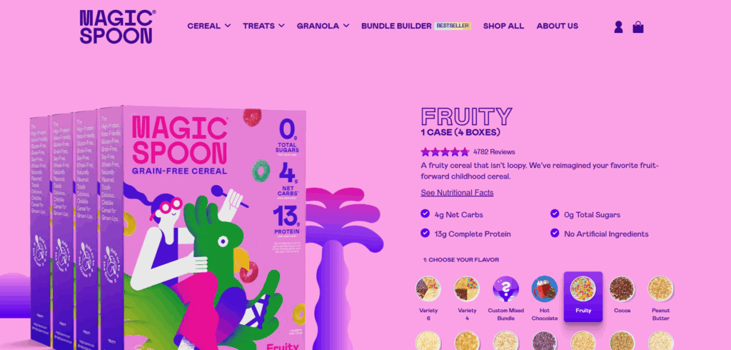
13. Price, variants, and availability: Can shoppers see exactly what they are buying?
Make the selected variant obvious. The price and availability should update correctly when someone changes an option. Test size and color plus quantity where relevant.
Test out-of-stock combinations too. A customer shouldn't be able to reach checkout with a variant you can't fulfill.
14. Delivery and returns near the decision: Can shoppers find the key shipping and return information before adding to cart?
Don't make people search through the footer to answer basic purchase questions.
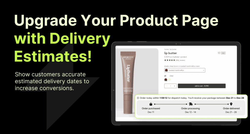
Near the purchase area, show a useful delivery estimate or link to one. Make the return window and important restrictions easy to find too.
Keep these promises consistent with your full policies and what your supplier can actually deliver.
15. Size and specification help: Can shoppers choose the right variant without guessing?
If size or compatibility matters, give people the information needed to choose correctly.
- Measurements
- Units that match your audience
- Compatibility information
- Fit notes you can support
Learn more: How to Convert Asian Sizes for Your Store
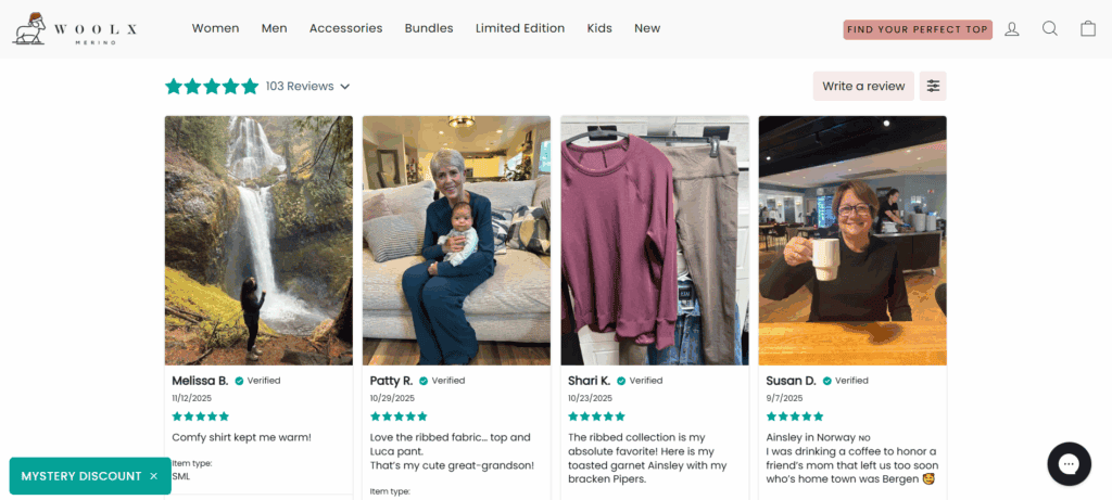
16. Reviews that help someone decide: Do reviews contain useful feedback instead of a wall of stars?
A good review section should help someone decide, not just show a wall of stars.
Look for comments about quality and fit plus setup or delivery. Real-use feedback is useful too. Make it clear where reviews come from and avoid presenting supplier or imported reviews in a misleading way.
If you use a review app such as Judge.me, check how imported reviews are labeled and displayed.
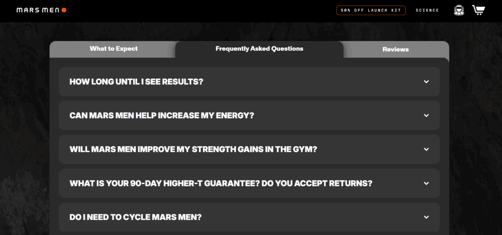
17. Common objections answered: Does the page cover the questions that could stop the purchase?
Think about what a cautious shopper would ask before paying.
- Will it fit?
- When will it arrive?
- Can I return it?
- What is included?
- Does it work with my device or use case?
Put the most important answers close to the purchase decision. A longer FAQ can sit further down the page.
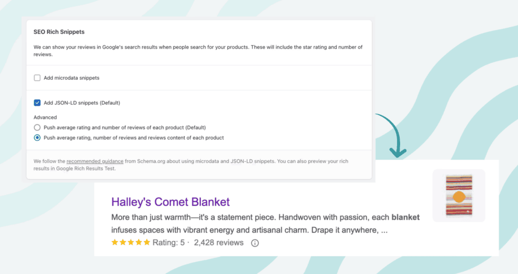
18. Product structured data: Does your structured data match the product information shoppers can see?
If organic search matters to your store, check your product structured data.
Google's product structured data documentation covers information such as price and availability. Shipping, returns, and ratings can also be included. That doesn't guarantee a specific rich result.
Use Google's Rich Results Test and Search Console to catch markup problems. If you use a Shopify review app, don't assume its schema is correct just because the stars appear on the page.
3. Cart and checkout
Got the product page in shape? Good. Now make sure the cart and checkout don't undo that work.
19. Editable cart: Can shoppers change quantities or remove products without fighting the interface?
The cart should make it obvious what is in the order and what each item costs.
Make quantity changes easy. If a shopper removes something, the total should update immediately and clearly.
20. No surprise costs: Are shipping, taxes, and other fees explained before the final payment step where possible?
A shopper shouldn't discover a major extra charge at the last possible moment.
If shipping depends on location, explain that clearly. If a tax or duty treatment varies by market, avoid promising a total you can't guarantee.
21. Relevant payment methods: Can your target customers pay in the ways they expect?
You don't need every payment method available.
You need the methods that matter in the countries you sell to. That can include cards and PayPal plus Apple Pay or Google Pay. Shop Pay or local options may matter too.
Learn more: Payment Gateways for Dropshipping
22. Low-friction checkout: Can someone buy easily on desktop and mobile?
Don't force account creation unless the account is genuinely needed.
Test checkout on a real phone and make sure autofill works where possible. Mobile wallets can reduce typing for customers who already use them.
If your platform supports guest checkout, test it. You can still invite the customer to create an account after the purchase when that makes sense.
23. Clear errors and discount behavior: Does checkout explain what went wrong when something fails?
Test invalid discount codes and missing address fields. Also test failed payments and unavailable shipping methods.
The customer should get a useful message instead of a generic error or a page that appears frozen.
24. HTTPS and checkout security: Does the store load securely without browser warnings?
Your storefront and checkout should load over HTTPS. The browser shouldn't show an insecure-connection or certificate warning.
Test product pages and the cart plus checkout. Check important embedded forms or payment steps too.
Don't judge security from a browser icon alone. Browser interfaces change, and HTTPS by itself doesn't prove a store is trustworthy.
25. Real test order: Have you completed the full purchase flow yourself?
Place a real test order before you spend time on smaller conversion tweaks.
Place a test order from product page to confirmation, then check taxes and shipping plus the confirmation email. Follow it through payment status, fulfillment handoff, and tracking.
Repeat the test after major theme or app changes. Do the same after payment or shipping changes.
4. Shipping, returns, and operations
Once someone pays, your job isn't over. Shipping and support are where trust is either kept or lost.
26. Processing and shipping separated: Do customers understand the difference?
Processing time is how long it takes before the order ships. Shipping time is the time the package spends in transit.
Don't combine them in a way that makes delivery look faster than it is.
27. Realistic delivery estimates: Are your promises based on the route your supplier actually uses?
A vague "fast shipping" badge tells the customer very little.
Give a realistic range where possible. If delivery changes by country or warehouse, make that clear.
28. Working order tracking: Can customers follow the shipment without contacting you?
Send a working tracking link when one is available.
Also test what happens before the carrier receives the package. A tracking page that shows "not found" for several days can create more confusion than it solves.
Learn more: How to Create a Shopify Track Your Order Page
29. Return policy that matches reality: Can you actually provide what the policy promises?
Your policy needs to match your supplier arrangement and the laws that apply to your business.
Spell out the return window and conditions, including who pays return shipping and where the item must go. If some products have different rules, say so.
Learn more: How to Create a Dropshipping Return Policy
30. Support process: Do customers know how to get help and when to expect a reply?
You don't need 24/7 live chat to provide good support.
You do need a support route you can maintain. Set a realistic response expectation and keep it consistent across your contact page, autoresponder, and policies.
31. Branded order emails: Do customers receive clear updates from your store rather than confusing supplier messages?
Review the order confirmation and shipping emails your customer actually receives.
They should use your store name and explain the next step. Include the order details and tracking information when available.
If you use an email platform such as Klaviyo, keep transactional information clear before adding promotional content.
32. Business and compliance basics: Have you checked the rules that apply where you operate and sell?
Business registration and tax rules vary by location. So do privacy and consumer rules. Don't assume a policy template or another store tells you what your business needs.
Check official requirements in your country and the markets you sell to. If you're unsure about a legal or tax obligation, check an official government source or ask a qualified local professional.
Learn more: Where Is Dropshipping Legal? and Dropshipping Taxes Guide
33. Backup fulfillment plan: What happens if your main supplier runs out of stock or stops shipping?
Don't wait for a backlog of paid orders to answer this.
Know if you have an alternative supplier or substitute product. Decide how you will handle longer shipping times and cancellations before the problem happens.
A backup doesn't need to be identical. It needs to be realistic enough that you know your options.
5. Mobile, speed, and accessibility
Now run the same journey on a real phone. Small usability problems become obvious fast here.
34. Real-device mobile test: Have you shopped your own store on an actual phone?
Don't rely only on the desktop browser's mobile preview.
Open the store on a real phone and go from homepage to purchase. Check text size and menus plus product galleries. Then check sticky elements, cart drawers, and checkout.
35. Easy tapping and navigation: Are important controls large enough and spaced well?
Buttons and links shouldn't require precise tapping.
Pay special attention to variant selectors and quantity controls. Check menu items, close buttons, and the cart too. Test the page with one hand instead of assuming it feels comfortable.
36. Forms that work: Can shoppers understand labels, errors, and required fields?
Check newsletter forms and contact forms plus checkout fields.
Don't rely on placeholder text as the only label. Error messages should explain what needs fixing and remain visible long enough to act on.
37. Core Web Vitals: Is the store fast, responsive, and visually stable for real visitors?
Skip the old rule that every page simply needs to "load in under three seconds."
Use PageSpeed Insights to check performance and field data where available. The current Core Web Vitals focus on loading speed, interaction responsiveness, and layout stability.
As a reference, Google's current "good" thresholds are LCP at 2.5 seconds or less and INP at 200 milliseconds or less. CLS should be 0.1 or less at the 75th percentile.
Watch the page while it loads too. Images and review widgets should stay stable instead of pushing important content around. The same applies to recommendation apps and sticky controls.
Learn more: Shopify Speed Optimization: 7 Ways to Make Your Store Faster
38. Basic accessibility: Can someone use the store without perfect vision or a mouse?
At minimum, check readable contrast and meaningful image alt text. Make sure form fields have labels and keyboard focus is visible.
Try navigating important pages with the Tab key. If you can't see where you are or activate a core control, fix that before adding more visual effects.
6. Tracking and store economics
If the store works, the next question is simple: are your numbers telling you the truth?
39. Ecommerce analytics: Are the actions that matter being recorded correctly?
At minimum, you need to know whether the purchase journey is being tracked correctly.
Check that product views and add-to-cart actions appear where you expect them. Do the same for checkout activity and purchases. If you use GA4, confirm the data after placing a test order.
Don't assume tracking is correct because a tag manager or app says "connected."
40. Ad conversion tracking: Are the platforms you spend money on receiving the right purchase events?
If you run paid ads, verify the tracking for those platforms separately.
Look for duplicate purchases and missing values. Check the currency too. Tracking problems can make a weak campaign look good or a good campaign look bad.
Learn more: How to Set Up Google Ads Conversion Tracking on Shopify
41. Funnel review: Do you know where shoppers are dropping out?
Look at the path from product view to add to cart, checkout, and purchase.
If product views are healthy but few people add to cart, focus on the product page and offer. If carts are healthy but checkout completion is weak, inspect shipping costs and payment errors plus checkout friction.
The exact "good" rate depends on your traffic source and store. Use your own trend first.
42. Profit per order: Do you know what is left after the costs attached to a sale?
Revenue looks nice, but it doesn't tell you whether an order was actually worthwhile.
Track product cost and shipping plus payment fees, then add discounts and refunds. Include advertising and other variable costs that apply to the order.
Learn more: Dropshipping Profit Margin Guide
43. A small weekly scorecard: Are you watching the metrics that actually change your decisions?
Don't build a dashboard with 30 numbers you never use.
A simple store might start with revenue and orders plus conversion rate. Add average order value and refund rate alongside profit or contribution margin; paid stores may also need CAC and ROAS.
If a spreadsheet becomes hard to maintain, tools such as Lifetimely or Triple Whale can bring these numbers into one view. Only pay for a dashboard if it saves you real work or answers questions you can't answer reliably now.
MER can be useful when you want a blended view of total revenue relative to total ad spend. It shouldn't replace a real profit calculation.
44. Behavior tools used for a question: Are heatmaps or session replays helping you investigate a real problem?
Tools such as Hotjar or Microsoft Clarity show how visitors interact with a page.
Use them with a question in mind. For example: are visitors missing the size guide, repeatedly tapping a broken element, or stopping before the shipping information?
Review your privacy and consent obligations before recording user behavior. Requirements depend on where you operate and which tools you use.
7. Retention and growth experiments
This is where growth tactics start to make sense. But only after the basics above are working.
These tactics can help, but they aren't requirements for a good store.
Pick the ones that fit your product and customer behavior, then test them instead of assuming they'll work.
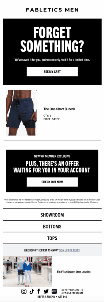
45. Abandoned checkout flow: Are you following up with shoppers who started checkout but did not finish?
An abandoned checkout flow can bring some shoppers back when the store has permission to contact them.
Keep the first message useful by reminding them what was left and linking back to checkout. A discount is optional, not mandatory.
Learn more: Abandoned Cart Emails for Ecommerce
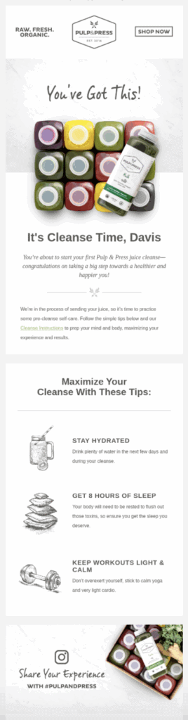
46. Welcome and post-purchase email flows: Are you using email to help rather than simply send more promotions?
A welcome flow can introduce the brand and useful products to new subscribers.
After a purchase, send the information the customer needs first. Then consider product tips, review requests, or a relevant follow-up offer.
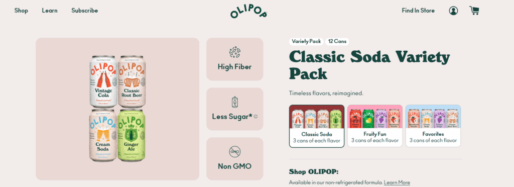
47. Bundles and cross-sells: Is there a natural reason for the customer to buy another product?
Don't add random recommendations just to increase average order value.
A good bundle solves one bigger problem or combines products people genuinely use together. A useful cross-sell should make sense next to the item already in the cart.
48. Quantity or free-shipping incentives: Do the economics still work when customers qualify for the deal?
A quantity discount or free-shipping threshold may encourage a larger order.
Calculate the margin first. A higher AOV isn't useful if the discount and extra shipping cost remove the profit.
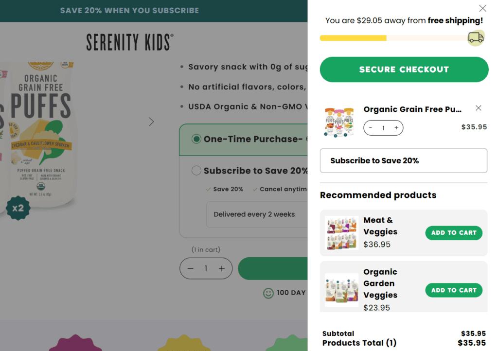
If you use a free-shipping threshold, a clear cart progress message can show how close the customer is.
49. Subscription or reorder option: Does the product naturally need replacing or replenishing?
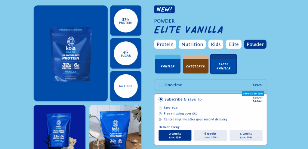
A subscription makes sense when customers have a real reason to reorder on a schedule.
Consumables and frequently replaced products can fit. A one-time gadget usually doesn't.
If you offer a subscription, make the recurring price and frequency clear. Customers should also understand how to manage or cancel it.
50. One useful test at a time: Are you testing a clear hypothesis instead of changing five things together?
And no, you don't need an A/B testing app on day one.
When you have enough traffic to test, start with changes that could affect a real decision. Offer wording and product-page structure are useful starting points. Shipping presentation and bundle design can be worth testing too.
Write down what you changed and what metric should move. If you change everything at once, you won't know what helped.
Keep the persuasion honest: scarcity and countdowns should be real. The same goes for guarantees, customer counts, and savings claims.
What should you fix first?
If this checklist gave you 20 things to change, don't try to do them all this weekend.
Start with anything that can stop or mislead a customer:
- Broken or confusing checkout
- Unclear product or pricing information
- Shipping promises you can't reliably meet
- Missing return or support information
- Poor mobile usability
- Tracking that gives you the wrong numbers
Then fix the biggest remaining drop-off you can actually see in your data.
Only after that should you spend time on extra popups or upsells. Gamification and another conversion app can come later too.
In other words, a cleaner store with accurate information usually deserves priority over a store with more tactics.
Want to keep improving your store?
These guides are good next steps if one part of the review stood out:
- Why Is No One Buying From My Online Store? 14 Things to Check
- Common Shopify Store Mistakes to Avoid
- How to Build Trust in a Dropshipping Store
- How to Find Your Dropshipping Target Audience
If you're still working through the bigger setup decisions, use our dropshipping checklist next.
Good luck with the next round of fixes!