Ready to start a PPC (Pay-Per-Click) advertisement campaign?
If so, read on!
In this article, we will cover ten great examples of PPC landing pages to maximize your conversion potential.

What is a PPC landing page?
A PPC landing page is a web page on your ecommerce store intended solely for use in paid ad campaigns on platforms such as Google Ads.
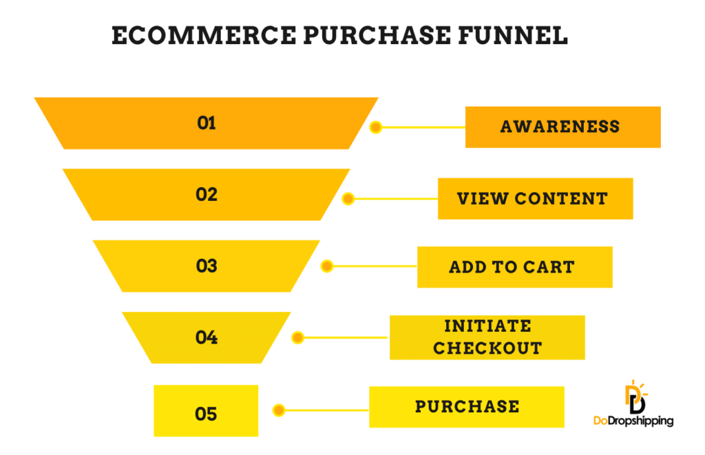
The landing page can be highly tailored to target specific keyword phrases and demographics, with the end-goal being to pull the user down the sales funnel in a much more streamlined manner.
10 amazing PPC landing page examples
Now that we know what a PPC landing page is, let's dive right in and look at some of the best examples out there.
1. Compare The Market
Before showing the example, let's look at what we searched to check the keyword phrase relevance against the landing page.
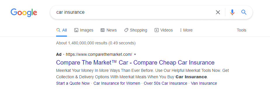
All PPC results have the 'Ad' tag, as shown above. Straight away, we can tell that the ad is incredibly relevant to the term searched.
Compare The Market is a huge comparison site that covers everything financial from insurance to energy supply and mortgages.
So you should now see why a PPC landing page is so important to use, as when I search for 'car insurance,' I'd expect to be taken to that section of the website and not have to find my way there.
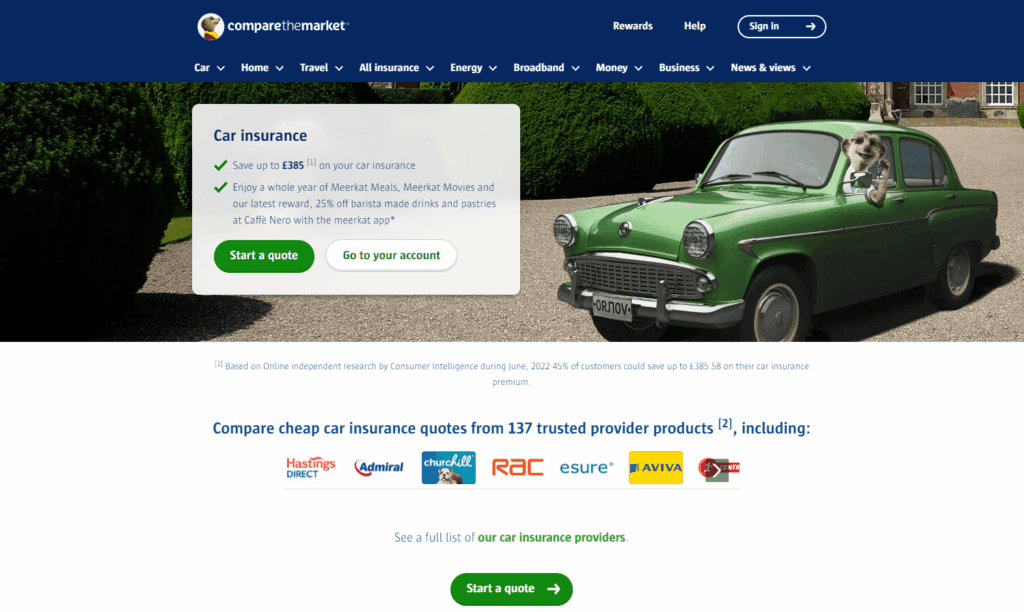
What's great about this PPC landing page is the user immediately knows that they're in the right place. The user will see the header titled 'Car insurance' first.
There's also no confusion over what the user will do next by the green button titled 'Start a quote'; this is a call-to-action button.
Additionally, a log-in button is placed on the side. Logged-in users have their search preferences saved, making the quotation process faster.
Finally, we have the social proof right below this; Compare The Market has listed all the insurance companies they work with. Social proof is a great way to reassure the user that you're an established company and that the user is in good hands.
2. Pizza Hut
For the next example, we'll look at Pizza Hut.
The search keyphrase delivers the paid ad as expected and lists some of their promotions in the sitelinks at the bottom of the ad.

What's so good about this PPC landing page is the no-nonsense landing page. It isn't full of distractions, and the call-to-action is simple.
The user can order for delivery, collection, or pre-book to dine in. This design covers everything the user could expect on one page.

Yes, the ad is great, but one thing we noticed here was the sitelink for the 'Latest Deals,' which didn't take us to their promotions page as expected but instead took us to the home page.
3. Virgin Media
Virgin Media is a British telecommunications company that provides telephone, television, and internet services in the United Kingdom.
In this case, we searched for the new iPhone 14, which showed what we were looking for.

This ad is packed with information such as free delivery, no upfront costs, and the minimum monthly charges. At this point, only the most engaged users will click on the ad.

What's great about this landing page is that just below the iPhone 14 product details, Virgin Media has a tool that helps users decide on the phone plan they want.
This kind of price transparency is exactly what the user is looking for; Virgin Media has outlined the data usage, contract term, and total monthly cost within their landing page.
It's natural for the user to want to shop around for a commitment such as this, so Virgin Media has made it easy for the user to compare the products.
4. Halifax
Halifax is a British banking brand and part of the Lloyds Banking Group.
We searched for 'mortgages' for their ad to be displayed, and the ad is incredibly relevant to the term.

In this ad, Halifax has incorporated its social proof and boasted about its award for the best mortgage lender.
Another great point to touch on is Halifax has added four sitelinks which are all incredibly relevant to the user's needs.

The subject of mortgages can be complex, especially for a first-time home buyer.
Halifax holds the user's hand on their PPC landing page, explaining how to get an agreement in principle and even adding a short video to break down quite a tricky subject.
The call-to-action button is also present, right below the bullet-pointed steps ensuring that the user reads this first.
5. Sky
For the next search, we looked at tv packages. As you can imagine, this is an ultra-competitive sector, and the paid results were plenty.

It's for this case, Sky went all out in their ad, delivering powerful statements such as 'Unmissable Deals' and reinforcing their social proof by saying 'install with confidence.'

Because of the competitiveness of this sector, it was expected for Sky's PPC landing page to highlight only their best current offers.

One element that wasn't so great was the call-to-action buttons, which led to a form to complete. If the user wants to look at the available deals, they may not be ready to start adding in their details, which can appear a little presumptuous.
We can only assume Sky have done this intending to collect data so that they can remarket their offers for missed conversion opportunities.
6. Papa Johns
For the following search, we tried something a little different and searched for 'restaurants near me.'
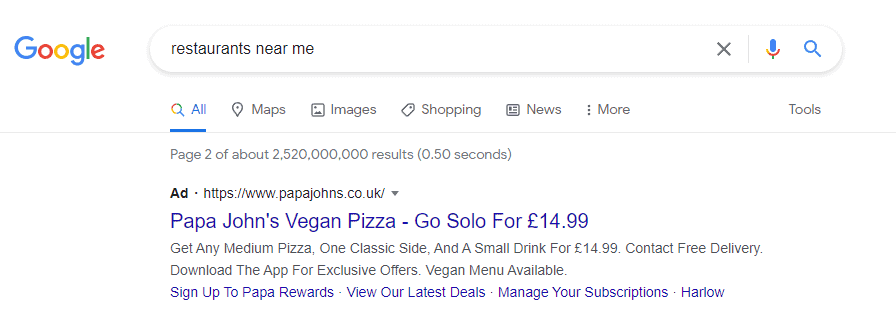
What's great about this is that Google has used geotagging to better deliver ads with more relevance to users.
This practice, even though it uses a broader search term, will still result in a higher conversion rate as the ads will deliver to users within proximity of the business.
Papa Johns encourages the user to download their app in the ad; in doing so, the user will typically benefit from several promotions.

The landing page is simple, with a slider showcasing current promotions and a call-to-action button. This button takes the user to another page where they can enter their postcode to show them their closest branch.
What's so great about this ad is that the user experience is almost seamless and quickly carries the user down the sales funnel. This will assist tremendously in a stronger conversion rate.
7. Samsung
Samsung has packed its ad with an answer to every question the user could have when looking for a TV. They also mention a flash sale adding a sense of urgency to purchase.
The user is reassured that their deliveries are fully tracked and free, and Samsung has highlighted their finance options.

The landing page for this ad is equally as impressive, showing the different ranges of TVs on a slider.
There is also a secondary slider right below it that highlights all of their current promotions available, each with a call-to-action button.

Another nice feature with Samsung is that the little icon in the bottom-right of the landing page connects the user to an agent who will assist them with any questions they may have.
8. Amazon Prime
Yes, even household names like Amazon must advertise through PPC ads.
The reason for this is their products and services span so far and wide that not everyone will know that you can find the latest movies on their platform, as they're better known for being the world's largest online store.

The landing page is simple, with a collage of their most popular movie titles to the left and a call-to-action button on the right.
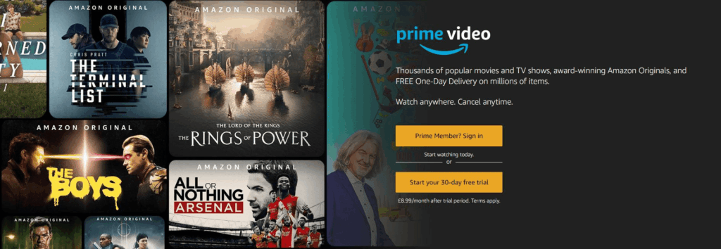
Their sales model is great for this type of ad, as they offer a 30-day trial that costs nothing to the user to try out.

An Amazon Prime plan consists of numerous features. When scrolling down slightly on the landing page, Amazon highlights that they're more than a streaming platform, with another call-to-action button.
9. Sainsbury's
For those unfamiliar with Sainsbury's, they're one of the largest supermarket chains in the UK.

When searching for 'UK supermarkets,' their ad was loaded with useful information such as delivery information and collection options. Additionally, they've included their rating to add some social proof to the ad.

The landing page is very simple and to the point, yet again, focusing on the delivery and collection options available with three different links to select.
All of these links require the user to register or sign in; however, this is usually expected at this sales funnel stage.
10. Fiverr
Last but most certainly not least, we have Fiverr, a global online marketplace for freelance services.
This ad showed up when searching for 'freelancing work,' which means their ad is very relevant to the service they provide.
Fiverr outlines a few of the popular services that can be found on their platform as well as offering reassurance with their 24/7 support.

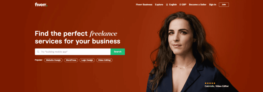
Fiverr's landing page is stunning; it has a simple search call-to-action button with a field for the user to search for the type of work they're looking for.
Additionally, they have some of their popular searches right below it just to add a little extra quality of life for the user.
Start your store on Shopify
Free 3-day trial + $1/month for 3 months
- Grows with you from first test product to full brand
- 8,000+ apps & themes to customize your store
- Beginner-friendly editor with pro features when you’re ready
No card to start. Cancel anytime.
5 tips for creating the best PPC landing page
Now that we've looked at the best examples of PPC landing pages, we'll give a few tips for when you're putting together your own.
1. Keep it relevant to the keywords
All of the ads were very relevant to the keywords searched.

This is crucial because if you have a general store selling various products, you'll want your customer to click your ad and be taken directly to the product or range of products.
If the customer is led to something remotely irrelevant to the keywords, they will quickly lose interest and look elsewhere, resulting in a wasted paid click.
You can learn more about keyword research for Google Ads here.
Many companies we looked at reinforced their social proof on both the ad and the landing page. This mainly aims to reassure the user that they're in good hands.

Social proof can come in different shapes and forms, such as a large social media following, positive reviews, or awards in their industry.
3. Make sure the landing page is mobile friendly
In the second quarter of 2022, 59% of internet traffic came from a mobile device.
Your PPC landing page should be built with mobile users in mind; large images and endless scrolling will bore the user and take a while to load.

The PPC landing page shown above was with LG. This was stunning to look at and consisted of many animations and sliders. But the problem was it felt very clunky and loaded quite slowly on a mobile device.
So it's no surprise why one of the main turn-offs for a would-be customer is a slow-loading page. This is why a mobile-friendly PPC landing page is essential in maximizing your conversion potential.
4. Cater to your audience
Knowing your audience is crucial in being able to relate to them and, ultimately, whether they'll shop with you or not. The language on your PPC landing page is important for this reason.
If, for example, you're selling golf clubs, you will likely only be selling to golf enthusiasts, so in this case, it's fine to use semi-technical talk as the user can relate to it.
5. Create a sense of urgency
Creating urgency is a great strategy to secure a sale from an undecided user who may be simply window shopping as it appeals to their more impulsive side.

Looking at the above example with Laptops Direct, they have shown the product in stock and the date you can have it (two days from the time of writing this).
The price tag is in big, bold red letters, and a PayPal repayment plan is also shown right below it.
This is great because the PPC landing page has crossed out the main reservations that the user may have, be it money or time they have to wait for the product to arrive.
Turn this guide into an AI checklist
Click your favorite AI tool below to get a short summary and step-by-step checklist based on this article.Prefer ChatGPT? Open this guide in ChatGPT with a pre-filled prompt (most readers start here).
Summary
Before we move on to the conclusion, we've put together a quick summary of this article for you:
- Simplicity is key to a high-converting PPC landing page.
- Guide the user by clarifying what action is next; call-to-action buttons help with this.
- Keywords must be relevant to the landing page.
- Add social proof to your landing page; the customer wants to know what others think of you and your product.
- Make sure your PPC landing page is mobile-friendly, as 59% of internet traffic is on mobile devices.
- Combine all of the above, and you're good to go!
Conclusion
This article looked at some of the best PPC landing pages and why we think they're so great.
One of the main common features they all have is simplicity, the user knew exactly where they were in the store, and the store guided them through the sale funnel, which leads us to our next point.
All of the examples we looked at had a call-to-action button; this lets the user know what the next step of their journey in your store is.

Another factor we touched on was the relevance to what the user searched for. We explained why this is important because if a user has come to your store by accident, you've likely paid for a wasted click. It's for this reason understanding your chosen keywords is so important.
We discovered that promoting sales was a great way to provide both a sense of urgency and added value; PPC landing pages with promotions greatly contribute to better conversion rates.
Finally, we looked at a few ways to maximize your PPC landing page's potential such as providing social proof, catering to your audience, and making sure the landing page is mobile-friendly.
What we can take away from this is that there isn't one thing you can do to make your PPC landing page amazing, but rather a combination of all of the above.
The user has already searched for your product and landed in your store, so it's your job to ensure that they have a streamlined journey down your sales funnel, ticking all of their mental boxes along the way.
Interested in more landing page examples? Check out this article with 9 great examples!
Want to learn more about Google Ads?
Ready to move your Google Ads skills to the next level? Check out the articles below:
- 15 Great Google Ad Examples for Ecommerce | Inspiration
- 12 Reasons Why You Need Google Ads for Your Ecommerce Store
- Google Ads Keyword Research for Dropshipping Stores (Learn How)
Plus, don't forget to check out our in-depth how to start with Google Ads guide here!


